I probably was late with my report on the new system of the kitchen structure “Method from Ikea”.
But the beginning of April was too busy ... And a walk along ikea usually takes a lot of time :)))
But today it so happened that I found three hours and went to learn a new “method” from ikea :)

“We hasten to introduce you METHOD: this is our new modular kitchen system. By the word "new" we mean fundamentally new elements that are part of it: frames, facades, loops and much more! All these elements allow you to create the most comfortable and unique kitchen. Did you think that the kitchen of your dreams will not fit in your existing space or fit into your budget? Or maybe they just didn’t find anything suitable? Explore this section - don't limit your dream! ” - words from the site of IKEA website sound.
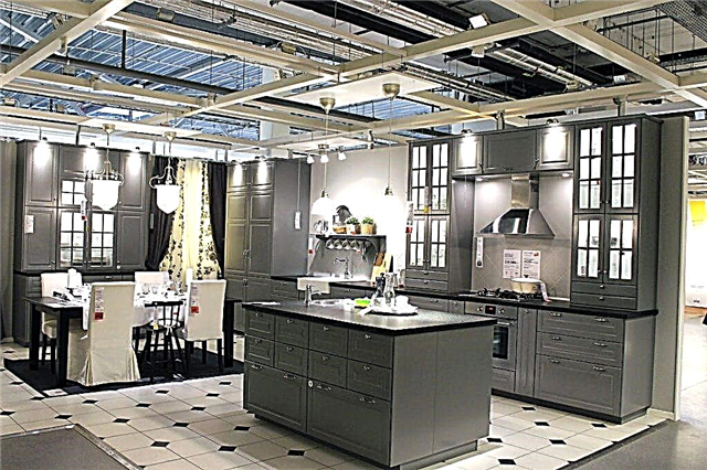
Interesting? Of course ... it’s interesting not even because it is something new ... but because now, unfortunately, in this price range (already far away and not quite cheap) ... IKEA still has no competitors.
I also loved the old Factum, especially in the last couple of years Ikea pleased with the colors of the facades and the quality of the finish ... It is a pity that 6 years ago there was no such choice.

After today's walk, I’ll probably say that I won’t have anything against setting myself an IKEA kitchen. Although my lyuboff was given to the Germans .. hmm ... But we're talking about Ikea :) and the new Method.

What is new in it?
basically ALL!
I warn you - a lot of photos :)))

Let's go through the sizes:
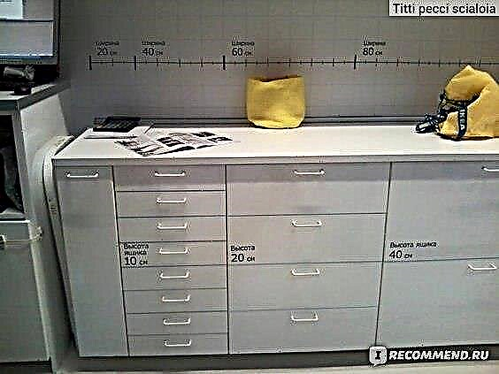
The new method became a multiple of 20 cm. And the size range of the width of the cabinets is now this:
The width of the cabinets from METHOD is 20, 40, 60, 80 cm.
Depth of cabinets: 37 and 60 cm. The depth of 37 cm is also in the lower cabinets.
together with the door, the depth will be: 62 and 39 cm, respectively.
Cabinets Height:
the lower cabinets are all 80 cm high.
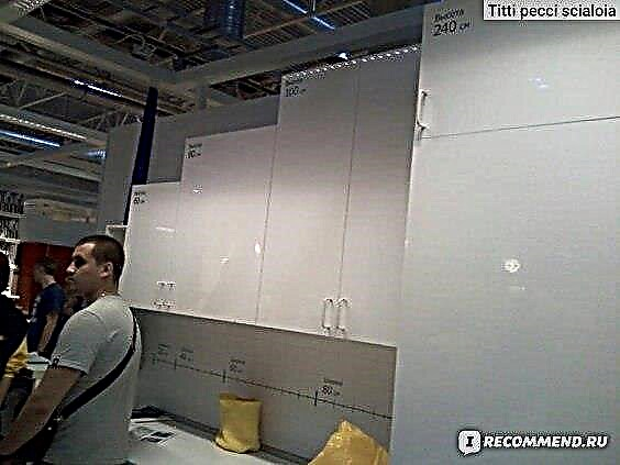
top: 40, 60, 80, 100 cm
columns: 200, 220, 140 cm
add-on height: 40 cm.
leg height: min 8 maximum 16 cm.
Skirting board height - 8 cm.
Yes, there are no longer 30 cm cupboards .. and there is no 45 cm cupboard .. and there is no 45 cm front. Therefore, there is no need to set a goal - go tormenting IKEA sellers and managers - how can I put a 45 cm dishwasher ... Very simple - choose 60 cm facade. In the remaining 15 cm, you can build in a sliding basket of 10-15 cm for tablets and other cleaning products - very convenient.

However, one BUT is in the choice of built-in equipment: Ikea gently hints at the acquisition of equipment from her ... Let's see ...
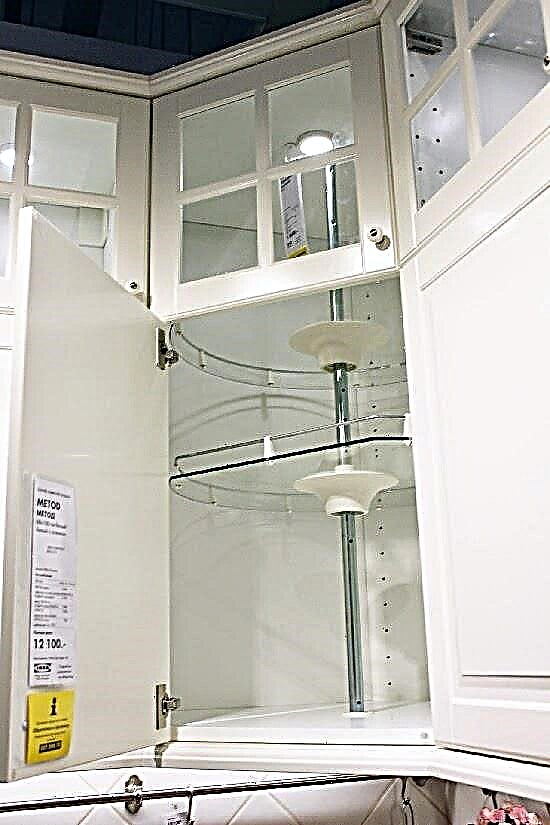
Here on the wall in the office. VKontakte group had a question about a separate gas stove:
" - Good day! Question on new kitchens METHOD - is it possible to install NOT a built-in gas stove? The height of the lower drawers is more than 90 cm (drawer + base + countertop), the height of standard plates is 85 cm. How to deal with these?
- Eugene, good afternoon! If you are interested in a podium for a stove, then the METOD kitchen range has a special superstructure that allows you to raise the stove to a height of up to 7 cm. “
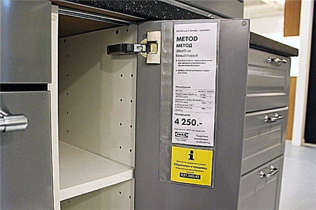
Many began to complain about inconvenient sizes ... Well, I don’t know, my opinion is that everything is fine.
This is not a premium class kitchen where everyone is doing everything in a hurry for your kitchen. This is a segment that does not have to wait ... you can "design for yourself a loved one", bring and collect in almost one day. Of course you won’t get it in one day .. well, for three or four - sure!
What are other news? Or old?


Colour.
I liked the color palette and the quality level of the facades. The color scheme and style of the facades is quite diverse. I think now you can easily choose a combination for almost any interior idea.

And glossy facades, and veneered, and painted. From bright white to black. With rasteklovkoy and just deaf. frame and frameless ... I liked the beautiful yellow color. so nice ... very nice. But the black kitchen looked very stylish. I really didn’t like the pens on the sample. From this set of pens 30 options as they are now could pick up others. IMHO.
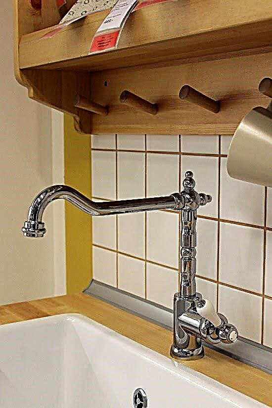
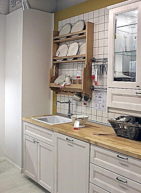
There are now two primary colors for frames: white and dark brown. And for the interior, funny inserts called TUTEMO appeared. The brightest colors. The stand features a white kitchen with such inserts - very cool! Of course, the idea is not new .. and the Italians have been offering such open colored shelves for three years now ... But here the trend has reached Ikea .. But look carefully at the sizes. These inserts are not present in all.
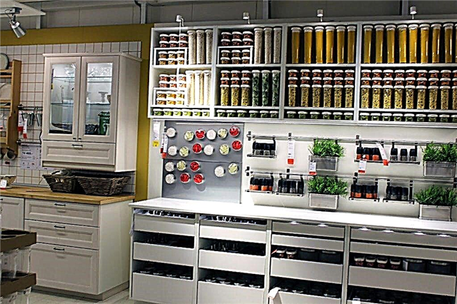

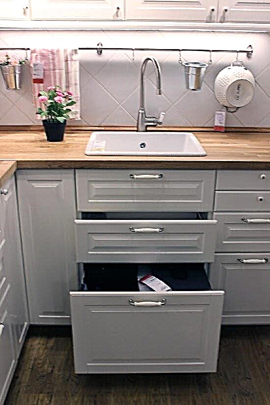
There were facades of 10 cm tall for drawers. Now you can make 8 drawers in one cabinet! Cool ... good for storing tablecloths, napkins ... little things .. (I already imagined it as if I had laid out all my culinary there.
There are no complaints about the cabinets, I turned it, turned it, opened all the doors in almost all the exposed kitchens ...

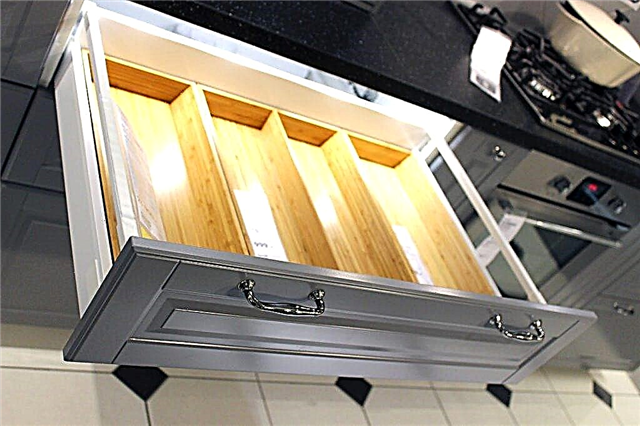
A lot of samples with a push-up system or facades “without handles”. The kitchens look very stylish of course ...
I pushed enough. The result: the opening is smooth, they do not open right away to the full depth, but by 10 cm. Then, with your hands, bring to the desired turning angle.
Closes also smoothly.
Of course on all the glossy facades there were fingerprints ... on the light ones it is not so noticeable, on the dark ones strongly.



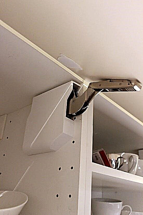
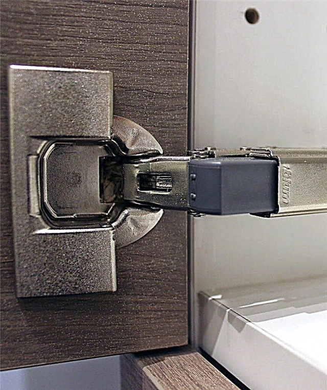
Hinges. Everyone said that the bloom will go away ... did not go away ... at least on samples everywhere it is. Checked personally :)
Filling for cabinets is similar as it was before. Just resized.
Liked the containers of my favorites in the new method. Very well they get up there in terms of width and depth. If someone does not remember - they have put things in order in the Kitchen cabinets not Ikea. READ this story.
What else? The back is the same .. the hardboard is ordinary, but everything seems to be well and qualitatively done.
I noticed that all cabinets now offer to fasten to the wall on the bar, both upper and lower. The upper cabinets are approximately 5 mm behind the wall.


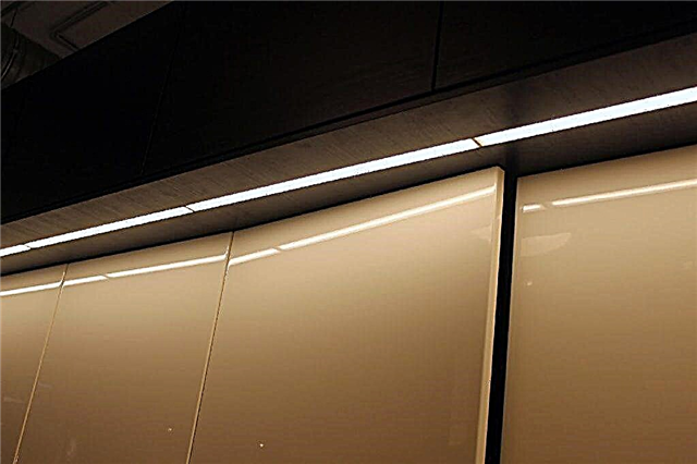
I liked the proposed built-in illumination of the working area. Pleasant not very bright, but comfortable light.
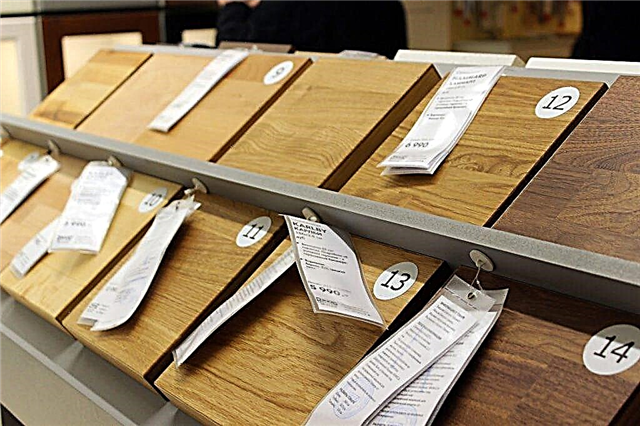


It seemed to me that they increased the variety of countertops. At least the choice of 4 rows pleased. A lot of natural wood.
The thickness of the countertops is from 1.8 cm to 3.8 cm.
Everyone is talking about cost now. I can not reason, since the last time I cheated on IKEA customers two years ago ...
But there are reviews that has become more expensive - tell me, and what has not risen in price over the past half year? :)


You can still plan everything yourself. The site has an ikeev planner already updated. Managers claim to work well. I did not check it myself.
“Friends, at present the METHOD kitchen planner is working normally, we didn’t notice any failures. If the program does not load or does not work correctly, we recommend checking the system requirements. Also, changing browsers or clearing cookies often helps get rid of such problems. ” with of the IKEA VKONTAKTE group.
In Ikea Khimki (Moscow), we increased the number of desks with computers for working both with ourselves and with managers. Today there was no huge queue, but since it is completely electronic, when you walk through the halls, you occasionally hear how they are eager to get a kitchen by number.
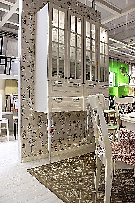
I liked the idea of an impromptu buffet. These legs are sold in Ikea in the Canteen department - countertops and legs.
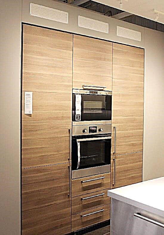
Ventilated inserts appeared in skirting boards and cornices.

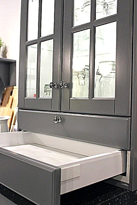
really liked the pull-out sections at the desk cupboards.


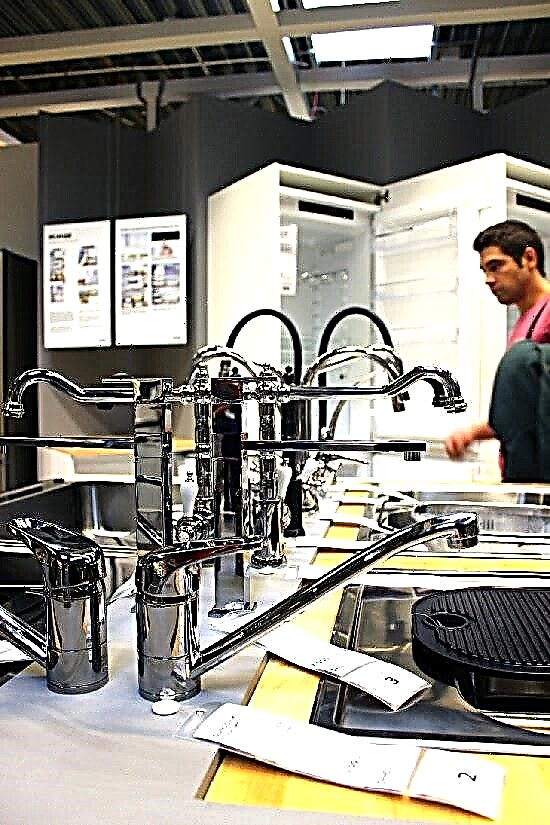


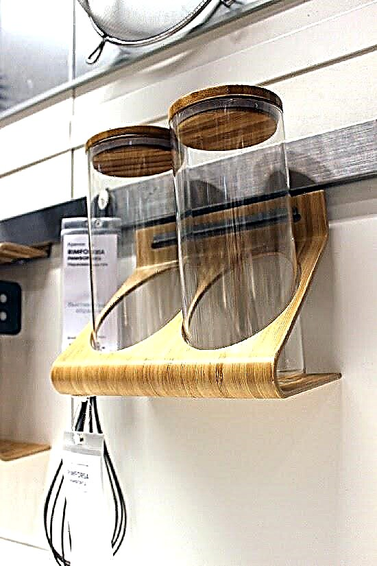
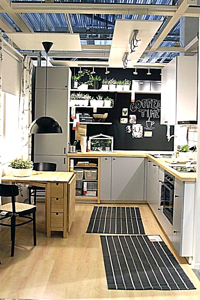


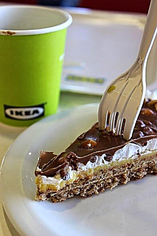
After the walk, I sat in a cafe, ate my favorite cake .. and flipped through the METHOD manual.
I can say - a useful thing! No wonder I took myself :) And I advise you!
I hope you enjoyed my trip to IKEA.
BIG ARTICLE, BUT AT THE END IS A VIDEO VERSION!
The ikea model is very simple, put the parts of different manufacturers in one box, so that later it turns out some PAX, KNOKSKHULT or some other strange name for little money. But something seems to have gone wrong.
Now you will find out what kind of superprofit Ikea gets literally on sawdust. Will a simple person be able to make a kitchen similar to ikeevskaya without special knowledge and a special tool. And is it possible to make a kitchen yourself for 9000 rubles?
I’m Mary, and this is my Zen channel, where I make furniture with my own hands and equip a small home workshop. And I already made a cupboard, sofa and kitchen as in ikea. And a whole bunch of everything.
Let's start with the material.
What do you think they make their kitchens from?
Frames for the kitchen are made of chipboard (laminated particle board), and it's just glued sawdust covered with melamine film.
In Russia, there are a lot of factories for the manufacture of this material, but IKEA has factories around the world. Russia is no exception, with such a millionth turnover and profit in our country, they bought one of our plants and built another nearby, to produce and cut chipboard in Novgorod.
Inspired by Italy or Scandinavian cuisine IKEA METHOD with Italian soul and facades. The report is completed.
They decided to put the kitchen in the new apartment ikeevskaya, but only the frames of the cabinets. To give some personality, a countertop, an apron, a sink and built-in appliances were bought separately. The budget for the kitchen was determined at 55-60 thousand.

I read somewhere that IKEA has different items produced in different countries - you need to look at the label specifically on your item made in where. Our facades turned out to be produzione Italiana. It pleased!)

I'll start with premises.
We were supposed to have a kitchen-living room. Despite the small area of 12.85 sq.m. I wanted to make a full kitchen and a relaxation area with a sofa.
My husband wanted the sofa as much as possible, but I have a symmetrical kitchen. I had to concede 20 cm of the cabinet and equality came: the sofa was 2.28 and the length of the kitchen along the long part of the letter G was also 2.28.
This part of the room is dedicated to the kitchen.

It turned out about 1.95 to 2.28. Height 2.70.
On the preliminary plan, all engineering communications were marked, which the developer placed in the order we needed: a socket for the refrigerator, pipes for connecting a sink, a socket for a dishwasher, a socket for an oven.
Layout the kitchens were made L-shaped, where all the upper cabinets were placed only on the far wall, so as not to visually clutter up the cabinets with the entire small room, but not to lose storage space.
After several drafts, approximately such a plan was born, made on elementary paper in a box.

It is also very important to imagine the way of products from the refrigerator to the sink, from the sink to the stove, from the stove to the end user. Here the vegetables come out of the refrigerator and wait on the countertop for the queue for washing (40-80 cm of the working surface). Here the vegetables are washed and they need to be prepared for cooking (another plus 60-80 cm of the working surface). Here are the vegetables prepared and they need to be served in plates.
All the nuances of the location of the equipment are very well described in the IKEA guide "4 steps to your new kitchen." Even such as "washing dishes standing by the window is nice, but if the windows open inward, the mixer may interfere.")
As a result, on the facades I got the following composition: 60 under the sink, 5 connecting strip, 60 under the Skinanda dishwasher, 60 built-in oven, 40 just a cabinet with shelves.
About the new METHOD system.
Now the size of all cabinets is a multiple of 20.
20, 40, 60, 80. Previously, there were cabinets for 30 and 45.
The depth of the cabinets is 37 and 60. With doors + 2 cm. 39 and 62 cm, respectively.
Cabinets Height:
lower cupboards 80 cm.
Top: 40, 60, 80, 100 cm.
Tall: 200, 220, 140 cm. The largest door is 200 meters high.
The height of the legs under the skirting board is 8 cm., Without the skirting board 16 cm.
Skirting board height - 8 cm.
Thus, the height of the lower cabinets together with the countertop of 3.8 cm is a minimum of 91.8 cm. Previously, exactly 90.
Facades
Cost from about 14 to 24 in the lower-middle segment for simple facades. And then immediately from 30 to 45 for the same combination.


Countertops. Here pay attention. Most Nieikeev countertops 60 cm deep! And they do not fit the Ikea kitchens, as depth of lockers with doors 62 cm! Those. You are practically doomed to choose only from the ikea assortment. This is the assortment I don’t like. Many of the same type, many very simple. No beautiful natural stone. Take what is .. At the same time, their size is such that for a standard kitchen 3-4 meters you have to take 2 countertops, and this is 10 thousand. The size of countertops from other manufacturers is 3-4 meters at a price of 3-5 thousand apiece. You can only buy one!
Building in. Narrow dishwashers 45 cm from other manufacturers in the span, as there are no 45 cabinets. Ikea, as it were, boldly hints that it is better to buy from them. The price is at least 20 thousand for the simplest dishwasher.
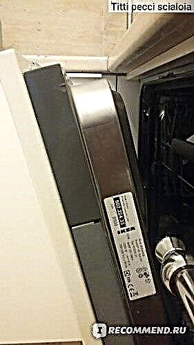
We bought Skinanda, which, according to sellers, rises to new sizes
Exposition.
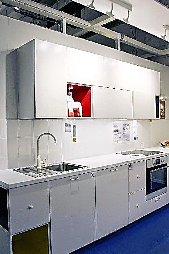
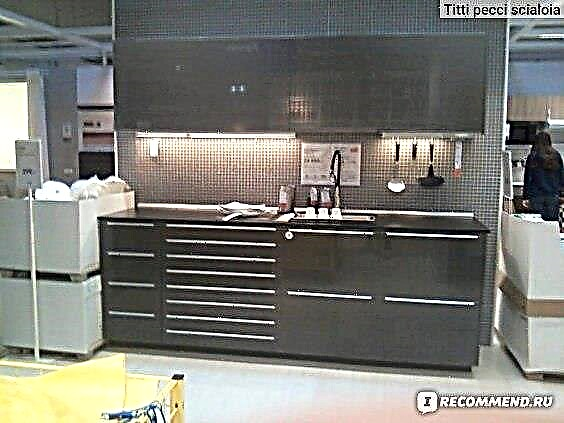
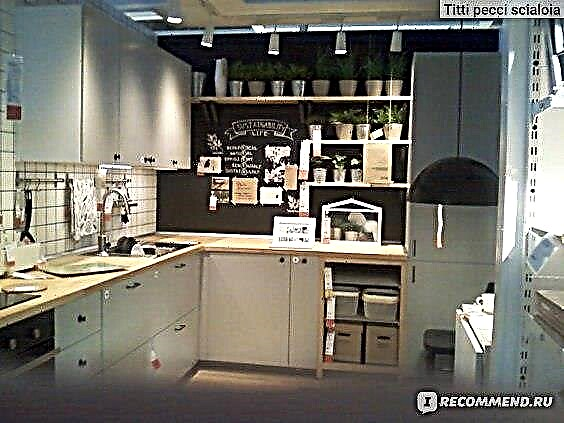
At the exposition, you can draw some ideas for your kitchen. Of all I liked the following projects:
A new metallic facade was used (1), 140 cm horizontal hinged cabinets (2), a slate board instead of an apron (3):

Design and checkout.
With a detailed preliminary plan, I went to Ikea on Monday morning. This is the best time to avoid the many hours of waiting for consultants.
On the plan I also noted where the doors open, how many drawers or shelves, signed the equipment and all sizes of cabinets.
She also wrote that all the built-in appliances are OWN. The countertop, sink, faucet are also OWN.
The consultant quickly orientated in my plan and only occasionally asked clarifying questions.
When the design project was completely ready, you need to check that you did not cram anything extra. For example, I refused a drawer under the oven - I never used it, and it affects the final cost. She also removed the illumination of the working surface, all sorts of built-in spotlights, hinged cornices and other "small things", which seem to cost a penny, but are not needed at all.
total price it turned out 55 thousand for sizes 1.20 to 2.28, the facades are white Wedding (19990 for a combination). This is only for the frames of cabinets, door facades, handles, skirting, legs and hinges.
Delivery cost 1330 rubles. Delivery can be on the same day, during registration in the morning or the next day at any selected time interval.
FROMborka.
The cost of assembly is now 8% of the cost of the kitchen. But they can count even more work if the wall on which the upper cabinets are hung is not capital, if you need to adjust it to fit somewhere, i.e. something to saw off, saw out and other nuances. A total of 24 items of additional works according to the price list.
Built-in appliances are also installed for an additional fee - 990 rubles per unit purchased in Ikea, 1490-NOT in Ikea. In fact, Ikeev’s could be installed for free. The equipment has become so expensive with them, the buyer is already forced to make a choice in their favor, and be kind enough to pay for the installation.
We refused assembly and we will install everything independently.
How to choose a topic. Ideas - Mood Board - Design
I wonder why people choose this or that design? For me, in the interior, the starting point may be some detail, object, texture, impression.
Designers use the Mood Board (or Inspiration Board - Inspiration or Mood Board). This is when some objects, textures, which form the general style, interior design, come together. We can say that this is such a modern wall newspaper, which gathers clippings from magazines, photos, etc.
For example, you like a glossy red kitchen and a specific sofa from N. Store. Something like it on ebay. And there is also a beautiful vintage sideboard from my grandmother, for which a place must also be found. Throw all these ideas into one file, arrange them around the room and watch how they are friends.If you are not very friendly or something is missing, then you can find supporting details in the interior for red glossy facades, order a sofa in a different shade, and put some ultramodern items in your grandmother’s sideboard to make him a resident of this decade.
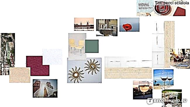
I initially got this picture:

Where is the kitchen and sofa IKEA, and the rest are specific items found in stores or on Ebay. It immediately becomes clear whether you will be comfortable in this interior or not. Maybe something will have to be abandoned, or vice versa to find a connective "tissue" for disparate things. I am a supporter of things "incomplete", so I do not really like ready-made combinations, but looking for my things.
But! One day I saw her! Countertop Dreams! From travertine. This is a soft sand-golden stone of a shell structure, which is mined in Italy, in the south of France, Turkey, Iran, Morocco and was previously widely used for cladding buildings.
Simple white smooth facades, just such as Ikeev's Wedding, were best suited to the travertine countertop.
Travertine tiles on a kitchen apron were also purchased.
Then I saw an article about the color of the year 2015, announced by Pantone. It became Marsala - the color of Sicilian wine. But I’ve been to different parts of Sicily many times, I really love the culture, cuisine, wines of this island. It was decided to order a sofa in the fabric of this wine color.
..Color is rich and saturated. In the real wine of Marsala we feel the aromas: vanilla, brown sugar, stewed apricots, dates ..
“A warming combination of red and brown with a pink and caramel hue, MARSALA 2015 has the same depth and complexity as the famous wine in Sicilian cuisine. It is a delightfully warm hue that you can feel its taste just by admiring.”
Well, then everything just happened! A house with a green roof looks out at the kitchen window

just like this house in the town of Noto in southeast Sicily

From the photos taken in Sicily, I picked up those suitable for the interior - here is Porta Felice - the gate of happiness from Palermo, here are the mars of Marsala, here is a fountain with drinking water from Noto, poppies blooming in May at Teatro Greco in Taormina. But we still had a box of olive tiles from the previous kitchen in the Provence style :)
In general, such a visualization of the future space by colors turned out approximately.
So in the end it turned out.


Pasta bolognese with minced beef


Nicoise salad with tuna


French cheese Tomme de chevre and Epoisses de Bourgogne

Shrimp Linguine with Fresh Peas

Sicilian pasta alla norm with eggplant, tomato, basil and ricotta

Tagliatelle with salmon, spinach, yolk and cream
Cool. So, the cost for them should be generally cheap, and the goods for the final consumer are very cheap. Yes?
But something is at odds with reality.
Chipboard is the cheapest material for furniture production. What do you think, how much does it really cost? SO MANY:
NO. The slabs are available in huge sizes, about two by three meters.
And in fact, a square meter of chipboard made in Russia for mere mortals like me starts at 200 rubles. I didn’t buy the cheapest and the highest quality for my kitchen for 330 rubles.
Ikea cuts and drills its material right at the factory. But we will not drag a three-meter sheet on ourselves? And here companies that are engaged in sawing chipboard come to the rescue.
Wait, and who needs companies that are sawing chipboard?
Almost all small furniture companies that call themselves factories order outside sawing of this material, as quality equipment is quite expensive.
Some manage to cut it all in the garage. In principle, nothing surprising, many still do plastic windows in garages.
The coolest thing in this story is that you and I can also use the services of such companies, in one place you can buy chipboard and there it will be cut to you in the exact size.
I repeat once again that, for this, you do not need to have any machines and special tools at home. After all, furniture is made from finished sheet material. But for the manufacture of real wooden furniture, this is indispensable.
Pros and cons of shopping at IKEA

We are all very demanding and, sometimes, even moody when it comes to service or assortment. And this is easy to understand, because everyone wants everything in the apartment to be perfect. But, as the English proverb says, “Nothing is perfect” ... Yes, and a person is arranged in such a way that he first of all draws attention to the shortcomings.
Here we start. Why? Yes, because there are far fewer advantages, besides, we intend to prove that it is more than just nitpicking.
The first argument that you can often find is high prices. It is truly amazing, because the company just became famous thanks to quite budget offers. Let's look at what is included in the price of the finished IKEA kitchen:
| Frames Facades Panels Countertop Hardware Cornices | Crates Socles Shelves Legs Washing Faucets. |
All this can be supplemented with wall accessories, railing, lighting, kitchen chairs, household appliances, doors, etc., corresponding to your style. There are even stickers on furniture legs and corner anti-traumatic nozzles for children! And if you are worried about the environment and sort out the garbage - you can buy 2-3 buckets that fit perfectly in the cabinet.
Plus, judge for yourself - how much time you will spend approximately on choosing and acquiring such a kitchen filling separately. Add a couple of hours to transport, some minutes to the queue, consultations, and, possibly, the return of inappropriate parts ... But time today is the most valuable resource.
Is it not more profitable to purchase everything at once, besides with the guarantee of full compliance of all elements with each other? We are sure that you can easily cope with the calculations.
The next undeserved accusation is a small selection of colors and shapes. And this is true when it comes to feather-decorated furniture inlaid with gold or rhinestones. But for ordinary queries, the choice is large enough.
The assortment has paneled, glass and glossy facades from pastel to fashionable bright colors. Moreover, the IKEA model range is represented by such design directions as:
And not just like that. These are the most popular design styles today, which makes such proposals more than rational. A little further in the article, we will definitely show some photos of examples of modern and classic IKEA kitchen interiors.
And the last nitpicking is easily soiled and demanding in care, the materials of which the furniture is made, depending on temperature conditions and humidity. But, you must admit, any material, and especially natural, requires some care, in the absence of which it can lose its shape. In addition to solid wood, fiberboard and chipboard are used for the production of kitchen facades and furniture frames.
This makes IKEA kitchens a more economical option, but rather an ideal combination of our price and European quality. Ask what other companies offer, and at the same time ask if they have the same modular system, which we will talk about a little later.
What are the benefits of buying kitchens at IKEA?
From buyers most often you can hear the following reviews: inexpensive, fast, high quality, convenient, functional, compact. In addition, the stylish kitchen "IKEA":
- made from high quality and practical materials,
- easy to assemble yourself (+ there are many videos on YouTube)
- easy to repair and replace parts,
- involve a large selection of combinations of cabinets, the number and shape of drawers,
- have a 25 year manufacturer’s free warranty,
- have a beautiful appearance and a pleasant color scheme,
- will be delivered as soon as possible,
- can be purchased by paying in installments,
- combined modular system "Method", which allows you to assemble furniture for the premises of the most complex layouts.
All the internal equipment of the kitchens can be purchased gradually and separately.
Modular systems "Factum" and "Method"
Convenience of IKEA furniture lies in the so-called modular system. All elements of the kitchen can be assembled as a designer, where everything fits everything. In one composition, if you wish, you combine at least all the colors.


Practicality is that the system offers a wide range of cabinets of different sizes and colors, which will make even the smallest kitchen as functional as possible. IKEA manufactures systems and equipment, taking into account the latest technologies and developments. For example, a faucet that reduces water consumption by 40% without changing the pressure.
You can start assembling the headset yourself, focusing on the instructions with a detailed step-by-step guide in Russian. And so that the assembly does not seem too boring, you can attract your children for easy and safe actions.
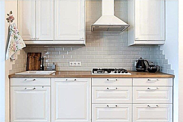

For example, here in these photos are several real interiors, assembled according to such a modular principle.
Interesting fact: Until 2015, it was called Factum, after which the company made a number of improvements and introduced a fundamentally new system - Method.


- socle height - 8 cm,
- new types of upper cabinets, however, already without sliding doors, among them - "Maximera" without legs 88 cm high,
- black-brown color of frames (in addition to already existing white) - now the visible part of the furniture does not need to be decorated with special panels,
- more than 20 types of facades and 30 types of handles,
- a much larger selection of internal drawers - different in height, depth, with and without a closer,
- box sizes - 20, 40, 60, 80 and 100 cm,
- the reliability and stability of the cabinets is ensured by galvanized steel strapping,
- new cabinet mounting system - steel rail,
- the height of the floor modules is standard - 60 and 80 cm,
- special adjustable legs for floor cabinets.
The colors of the facades remained unchanged, but the names changed.
The bulk of the IKEA products carries Swedish, Norwegian or Finnish names - sometimes unpronounceable or sounding like an ancient druid spell: Lidingo, Brockhult, Sofilund, Fagerland, Thingsried

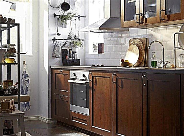

And this is not just a set of letters, but the words actually existing in the mentioned languages - female, male names, names of rivers, lakes, birds, precious stones, etc. Such a product naming system, as well as the principle of modularity, is a kind of visiting card of the brand.
Assortment "IKEA"
It is really huge, so we will focus only on a few relatively new lineups, because you can find the rest in the IKEA catalog if you wish. Here is a small table for reference:
| Old name | New Name / New Series | Style |
| Lidingo | Budbin | Classic |
| Ramsha | Laxarby | Classic |
| Overbu | Country, Art Nouveau, Scandinavia, Provence | |
| Dalarna | Provence | |
| Factum | Method | Classic |
Budbin
Cute cuisine Budbin - the most popular series of IKEA. They suggest a large number of components, which makes it easy to adjust the degree of filling of the kitchen space. Panel or glass facades made of chipboard or MDF are coated with a special varnish.
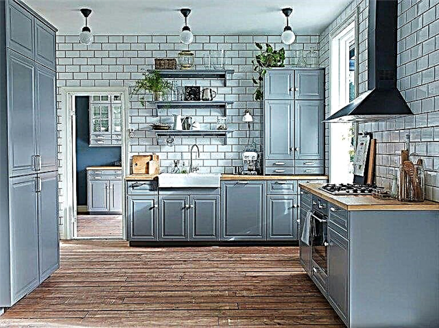
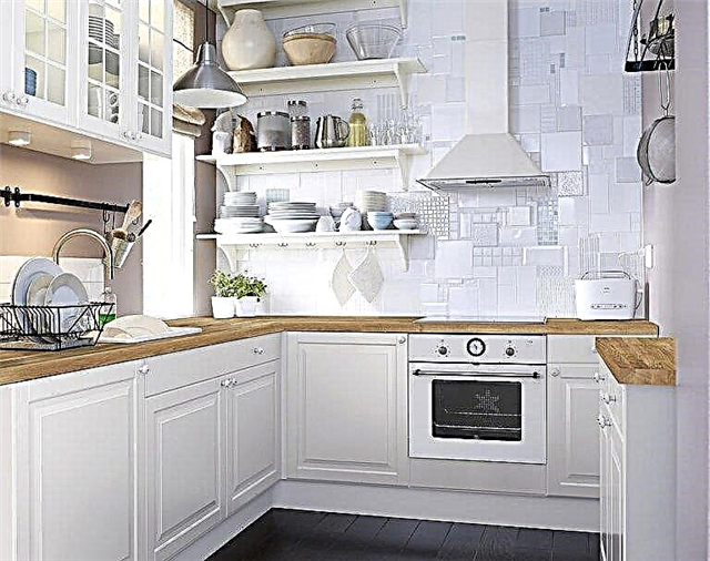
A white or gray set will suit many styles - Provence, classic, country, loft, shabby chic, art deco, etc. Light shades combined with natural wood will help to create a Scandinavian style kitchen. If the interior seems too plain and inconspicuous, complement it with brighter curtains and textiles, which are also available in the IKEA catalog.
For example, the photo below shows several options for the finished IKEA kitchen.


Saturated colors look great against the background of black facades. But, if the kitchen is small, this color should be a bit, because it tends to “eat up” space.
Only one “but” - furniture surfaces must never be cleaned with chemicals and abrasive products. Some advise using “Mr. Muscle” for glass, while others just use a well-wrung rag, after which everything needs to be wiped dry.
Dalarna
Being a supporter of the above-mentioned styles and preferring natural wood, pay attention to the new series of Dalarna facades. The furniture is made of solid birch, covered with protective stain and varnish. The model range is represented by cabinets, countertops, shelves, front and overlay panels that hide household appliances, glazed, wooden doors and socles.

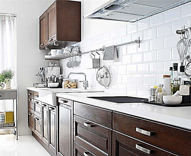
The offered colors are universal - white and black-brown. Such furniture will ensure the sophistication and naturalness of the kitchen, decorated in both classical and modern style. The following photos show compact interiors with spectacular tinted glass facades. The classic Laxarbi series is also partially made of solid birch.
Overbu
The latest, affordable series of wall and floor cabinets is characterized by a huge selection of sizes and the presence of removable shelves. Direct facades are made of laminated MDF and particleboard and coated with polyester paints or varnishes. Single, two-tone, bright, wood-like and other inexpensive facades and Overbu cabinets will organically fit into any style direction.


They can be supplemented with all kinds of accessories - curtains, tablecloths, curly pens. Modern furniture from this series is not pompous and will look great in an apartment or in a country house. The disadvantages of Overbu include the lack of a closer and sensitivity to moisture. All surfaces should be wiped dry with water.
Hitarp
Shabby-chic, Provence, country, classic, retro - fans of these areas will be pleased with the simple and functional Hitarp series, which has already managed to become a favorite of sales. Its advantage is a new convenient mounting system for hanging cabinets.
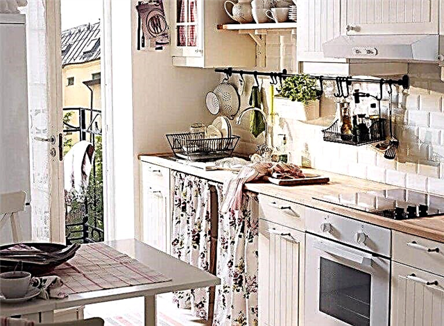

Uncomplicated lines, panels and glass inserts on the facades and lovely antique-style wall cabinets, as if made by hand, will provide a comfortable and relaxing interior. Light shades and vertical stripes tend to expand and stretch the space, so the series will suit both spacious and small kitchens.
Production material - chipboard or fiberboard, coated with acrylic and polyester paint, glass made by tempering technology. The monotony of the white interior of the kitchen gives unlimited opportunities for creativity and imagination.

There is another tricky maneuver for design. The fact is that the composition and design of the Hitarp series is similar to the headsets of the Filipstad, Budbin, Callarp, Albru and Knoxhult series. Therefore, some elements - countertops, pens, etc. can be borrowed from them.
Thanks to the modular system, you can easily combine different colors of the facades, make a black top, white bottom or complement the bright red corner headset with black horizontal surfaces.
Color schemes
Basically, IKEA products are represented by restrained colors - shades of white, gray, beige, light green, light blue and wood-brown. But there are more modern colors - bright red, metallic, yellow, etc. As you can see, they can be combined.


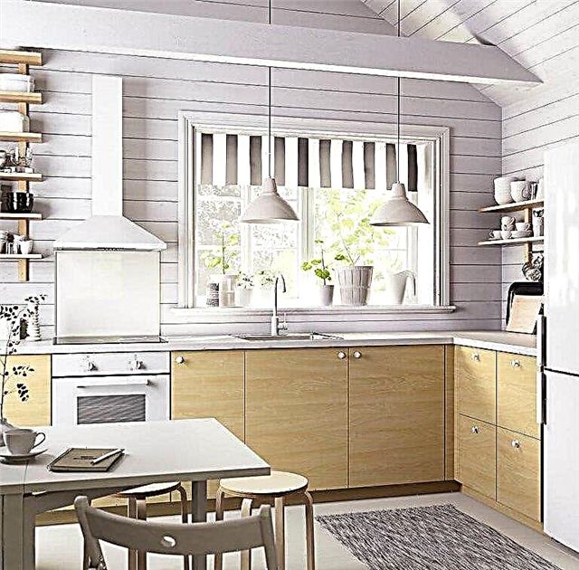

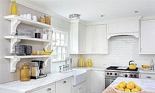
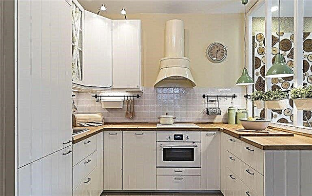
The white kitchen looks elegant and visually expands the walls, which is very important for small rooms, for example, in Khrushchev. But be careful: if you buy a new white kitchen instead of the old one of the same color, you might get the feeling that nothing has changed. Neither another form of kitchen facades, nor new handles will affect the situation.


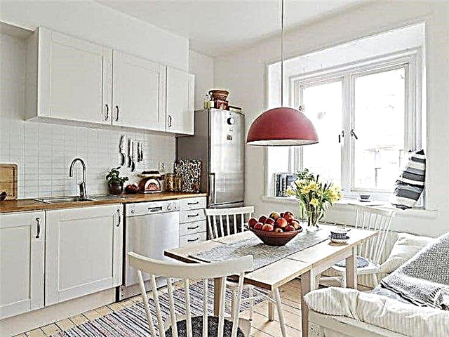
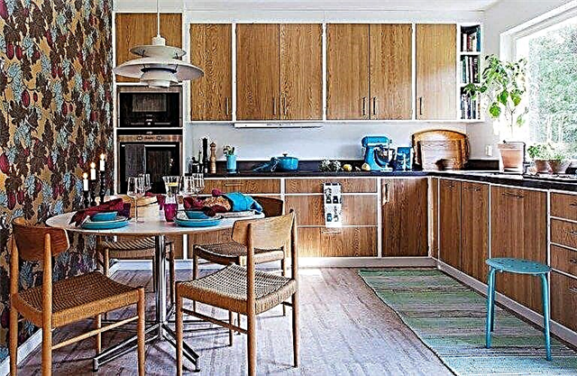
Think about the option with a wooden worktop that will dilute the boring colors. Look how compact and at the same time quite pleasant the interior of a small kitchen from IKEA can be. White facades will adorn the beige furniture handles, as well as exactly the opposite. Take a look at the photo - how this, at first glance, insignificant element changes the overall impression.
Contrast black and white kitchen can not be called retro, but also can not be attributed to the modern style. Here, everyone will determine the colors of the walls, apron, textiles and accessories.What do you think of the black and white chess floor?
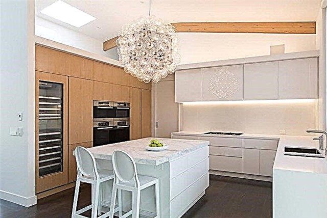


The gray kitchen is the height of elegance and practicality, because it is not as easily soiled as white, and not as gloomy as black. In addition, gray is in fashion today, which puts the Budbin kitchen in a number of relevant solutions for interior design. Countertops and countertops can be wood, white or black - depending on your preference. Glass may be transparent and darkened.
Black-brown color of the facades is appropriate in spacious rooms with lots of light. Snow-white or bright walls, a patterned or colored kitchen apron, kitchen chairs, a countertop and other horizontal planes of pastel colors and, of course, light shades of wood will help to dilute the excess of darkness.
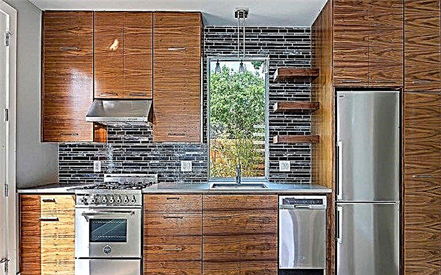
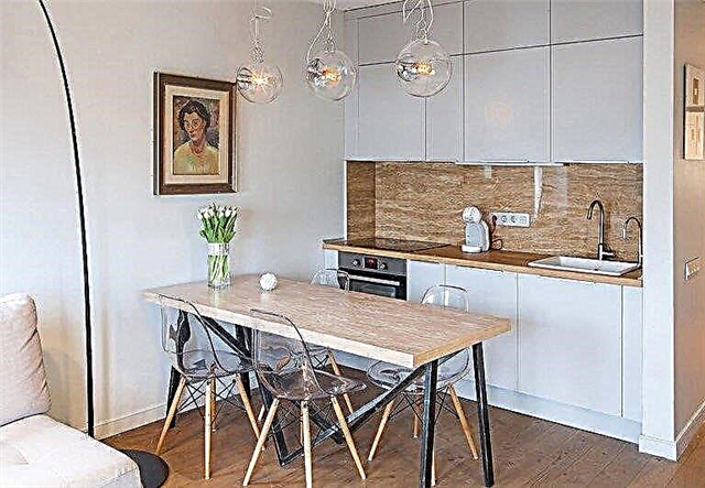


If you get tired of the color of the facades, you can always change it to any other - of course, available in the range.
In addition to colors, an important determining atmosphere is the convenient location of the kitchen modules, which is especially important in small kitchens.
Layout options
There is essentially nothing new here. "Ikea" kitchens are suitable for any of the existing types of furniture:
- Linear - the modules are located on the same line along the wall,
- L-shaped (angular),
- U-shaped
- two-linear (parallel),
- with an island or a peninsula.


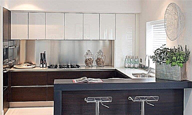
For clarity, here are a couple of photos of the IKEA corner gray kitchen. And here is a kitchen island.
It is believed that the first two methods are suitable for small kitchens, but with the competent organization of space, this opinion is easily refuted. An example of this is a small kitchen with a bar serving as a small island. If the module located in the middle of the kitchen is equipped with internal drawers, he can free up space on the walls. And, as you know, the wall-mounted headset burdens the room.
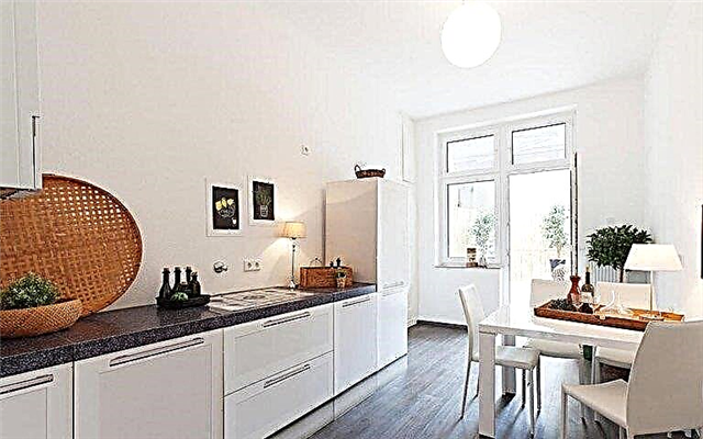

When arranging the necessary modules, apply the working triangle rule, i.e. Place everything you need for cooking as close to the work surface as possible. Think about what path you will move around, what equipment you will need, whether it can be put into a drawer and whether it will not be tiring to get it every time.
There is also the concept of a drying-washing triangle, the essence of which is not difficult to guess. The smaller the kitchen, the more rational it is necessary to manage the area - use the vertical, a place under the sink or over the hood, at the same time inaccessible to children. It’s very convenient that the IKEA website has an online layout available, and all you need to do is just set the right sizes.
Additional tips
1. Accurate measurements of the premises are the key to a successful result. You need to measure not just the width and height of the kitchen, but also the space occupied by the drainage, gas, ventilation, and other pipes. Not sure if you can handle it? Ask for help - for example, the same IKEA specialists.
Looking at the kitchen project, mentally slide out each drawer and make sure that nothing is blocking it. Open all the drawers and cabinets at the same time, then the window, the wall cabinets, all for the same purpose. In detail, imagine how you cook, on what path you are moving and what you get.


2. If you will not assemble the kitchen yourself and contact the IKEA employee, he, as well as other masters, will set a separate price for each type of work. Be prepared for this and clarify in advance how much this or that service costs.
3. You can win space due to the depth of the lockers. The deeper they are, the more space they occupy. Do you use all cabinet filling? Perhaps a couple of additional shelves will make a difference?
If the wall-mounted headset is deep, but you don’t know what size to choose, focus on your height and, oddly enough, the length of your arms. Stand on tiptoe in front of the wall, extend your arms, imagining that you want to get something out of the closet. Make the necessary marks on the same wall.


4. When purchasing furniture from certain materials, take an interest in their characteristics. This is important, because some of them are not designed for strong heating of the stove or constant exposure to moisture. Natural wood requires a certain level of humidity.
5. They say that habit is second nature. If before the furniture in the kitchen was with round handles, and now you intend to refuse them or choose another model - think carefully. Will it really be convenient for you?

6. Before buying, read the reviews, and even better - look at the photos of buyers. So you get the most accurate information, and most importantly - make sure that it is true.


This completes our short excursion. We are sure that the new IKEA kitchen design has pleased you, and what you read will prove to be useful and informative. We wish you a quick, inexpensive and magnificent interior renovation and inexhaustible inspiration for new creative combinations!
Well, now let's count a little. I must say right away that I will not count at the cheapest prices:
For example, take the standard frame of the module 800 by 600, in ikey it costs 1900 rubles, it’s just a frame made of chipboard with a rear wall of fiberboard, without handles, facades, fasteners, etc. But there are all the holes and a groove under the rear wall of the fiberboard.
For me, the price of chipboard and fiberboard with a cut will be 1195 rubles, along with a glued edge and additional parts instead of the ikeev metal ones.
- 240 rubles for drilling holes (yes, everyone does it in the same place where they saw)
- for two grooves for the back wall they will take 120 rubles.
Total 1,555 rubles in the most bourgeois situation without searching where it is cheaper and far from the cheapest chipboard and additive. And this is a similar set to Ikeevsky, where you do not need to drill anything.
Ikea 1900 rubles
Do it yourself 1555 rubles
There are two facades to such a cabinet, which means 4 loops.
Ikea uses company hinges Blum and sell 2 pieces for 450 rubles. We need 4, a total of 900 rubles per loop. In the special. A store with accessories absolutely the same can be bought at 140 rubles apiece when buying a box, for a total of 560 rubles.
Ikea 3700 rubles
DIY 2475 rubles
But is it possible to make a kitchen with your own hands even cheaper? or even for 9,000 rubles? Can!
- -240 rubles for the additive body because you can drill yourself
- -120 rubles for the grooves for the rear wall, because you can simply screw it on the back, as most companies do.
- -360 buy good loops, but budget ones from the company Boyard, for example, 50 rubles each
- -200 let's drill holes for the loops myself
- glue the edge yourself (no, I don’t advise this option to anyone)
TOTAL 2415 rubles, and I didn’t even choose chipboard cheaper, but left a good one.
It turns out that for 9660 rubles it will turn out to make a simple kitchen for any studio of 4 modules, either 4 lower, or 2 lower and 2 upper. Of course, the modules are already on top, but due to the fact that the upper part from the chipboard appears there, something like that + mounts will come out.
Total cost of a small kitchenette will be:
- If you drill yourself - 2615 * 4 = 9660 rubles + one evening.
- If you order everything according to the plan of full readiness as in ikea: 3335 * 4 = 13340 rubles
- If you order in ikea 5960 * 4 = 23840 rubles
I chose 1 option. Drill yourself. Because, I did a lot more modules, and my profit was already calculated in tens of thousands of rubles. And to be more precise, I counted 170,000 in ikey, then I calculated it myself, it turned out 140,000, but in the end I got three times cheaper, and why. You will learn from the following videos and articles. There will be about 20!
I will use an ordinary tool, no machine tools or scary programs.
I specially developed this project for more than 4 months in order to convey structured information and so that the design does not cause your rage and depression.
Let's share this article in the social. networks, because among your acquaintances there are definitely people who need it, or maybe someone can buy a couple more square meters of living space after learning that you can make furniture yourself and save tens of thousands of rubles.

